
Data visualization plays a crucial role in effectively communicating information and insights from data. In the realm of data analysis and presentation, Excel is a powerful tool that offers a wide range of chart types to visually represent data. Understanding the different types of charts available in Excel and their specific uses can greatly enhance the clarity and impact of your data visualization.
To begin, it is important to recognize the significance of data visualization. Visualizing data helps in understanding patterns, trends, and relationships within datasets, making complex information more accessible and comprehensible. It enables easier identification of outliers or anomalies, aids in decision-making, and facilitates effective communication of insights to a wide audience.
Excel provides a diverse array of chart types, each suited for different data types and analytical purposes. A comprehensive overview of Excel chart types includes:
- Column Charts
- Bar Charts
- Line Charts
- Pie Charts
- Scatter Charts
- Area Charts
- Bubble Charts
- Radar Charts
- Stock Charts
- Histograms
- Box and Whisker Plots
Choosing the right chart for your data is crucial to effectively convey your message. Several factors should be considered in this decision-making process, such as the type of data you are dealing with, the purpose of the chart, the need for comparisons and trends, highlighting data relationships, and the characteristics of your target audience and the context in which the visualization will be presented.
To ensure effective data visualization in Excel, here are some tips to keep in mind:
- Simplify the design and ensure clarity.
- Use appropriate labels, titles, and legends.
- Select the most relevant and accurate chart type for your data.
- Enhance visual appeal with colors, fonts, and formatting options.
- Provide adequate context and interpretations.
By leveraging the power of Excel’s charting capabilities and following best practices for data visualization, you can create visually compelling and informative charts that effectively communicate your data insights.
Why is Data Visualization Important?

Photo Credits: Exceladept.Com by Keith Jones
Why is Data Visualization Important?
Data visualization is crucial for effectively understanding and communicating complex information. It helps in identifying patterns, trends, and outliers. Visual representations make data easier to interpret and enable decision-making based on accurate insights. Visualizations enhance engagement and comprehension, as our brains are inherently wired to process visual information. It also aids in presenting data to non-technical audiences in a more accessible and impactful way. For example, during the 1854 cholera outbreak in London, Dr. John Snow used a map to visually depict the cases, identifying a contaminated water pump. This visualization led to a breakthrough in understanding the disease and ultimately saved lives.
Overview of Excel Chart Types
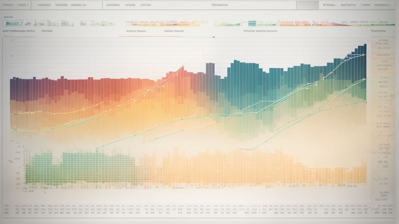
Photo Credits: Exceladept.Com by Eugene Williams
Get ready to dive into the world of data visualization with an overview of Excel chart types! We’ll explore a variety of chart options, each with its own unique purpose and visual appeal. From column charts and bar charts to line charts and pie charts, we’ll cover all the essentials. Get ready to unleash your data’s potential and communicate insights effectively. So, let’s embark on this data visualization journey and discover the power of Excel charts!
1. Column Charts
Column charts, also known as bar charts, are a widely used and popular means of visualizing data. These charts present information in a format that consists of vertical columns, allowing for easy comparison of values. They are particularly useful for displaying data trends and comparing various categories or time periods. Therefore, column charts are the go-to choice when dealing with data that involves distinct categories or different points in time.
For instance, a column chart can be employed to compare the sales figures of various months or to analyze the performance of different products. By representing data in a visual manner using column charts, it becomes more convenient to identify patterns, uncover any anomalies, and effectively convey insights to others.
2. Bar Charts
Bar charts, also known as bar graphs, are a widely used and popular type of graph for visualizing data. They are highly effective in displaying and comparing categorical data in a clear and concise manner. Bar charts consist of vertical bars that represent the different categories being analyzed. Each bar is specific to a particular category, and the length of the bar is proportional to the value or frequency associated with that category.
The simplicity and clarity of bar charts make them easy to read and interpret, which is why they are frequently utilized in presentations and reports across various industries. If you want to create a bar chart in Excel, simply select the relevant data and choose the “Bar Chart” option from the menu. It’s that simple!
One of the significant advantages of bar charts is their ability to identify trends, patterns, and outliers in data. By observing the heights of the bars, you can quickly discern any notable changes or discrepancies. This makes bar charts an invaluable tool for data analysis and decision-making processes.
3. Line Charts
Line charts, also known as line graphs, are a popular chart type in Excel that is frequently used to showcase data trends over time. These charts are highly effective in illustrating continuous data and displaying patterns or fluctuations. Line charts consist of a series of data points that are connected by straight line segments, forming a cohesive visual representation of the data. Excel users often rely on line charts to visualize data that showcases a progression or trend, such as stock prices or sales figures. Apart from this, line charts are also valuable for comparing multiple sets of data on a single chart. This functionality enables users to easily identify relationships among various data sets and make informed decisions based on the data analysis.
4. Pie Charts
Pie charts are an invaluable tool for effectively visualizing data that is divided into different categories and accurately displaying the proportion of each category. They offer a concise and transparent representation of how various categories contribute to the entirety. Specifically, pie charts are highly efficient when it comes to showcasing percentages or proportions. For instance, an effective utilization of pie charts can be observed in a sales report, where it portrays the percentage of sales that each product category generates. This visual representation enables viewers to readily comprehend the relative significance of each category. However, it is crucial to exercise caution when utilizing pie charts, especially if the number of categories is extensive, as this may result in a cluttered and less comprehensible chart.
5. Scatter Charts
Scatter charts, also known as scatter plots, are a powerful visualization tool used to effectively display the relationship between two numerical variables. These charts showcase how one variable responds or changes in relation to the other. In a scatter chart, each data point is represented by a plotted point on the horizontal and vertical axes, which correspond to the variables being analyzed. This type of chart is particularly valuable in identifying patterns, correlations, and outliers within a dataset. Its usefulness is especially prominent when dealing with extensive datasets or datasets that involve continuous variables. Excel offers a convenient way to create scatter charts by simply selecting the data and choosing the scatter chart option. Many fields, including scientific research, finance, and social sciences, rely on scatter charts for thorough data analysis and impactful presentations.
6. Area Charts
Area charts are a valuable type of data visualization tool that effectively display quantitative data over time. They excel at illustrating trends and patterns. An area chart is comprised of a line connecting a series of data points, and the space below the line is filled in to reflect the magnitude of the data. Area charts are frequently utilized to compare multiple data sets or to showcase the cumulative total of a variable. They provide a visually appealing representation of data that is straightforward to interpret and comprehend. To ensure accurate representation and ease of readability, it is essential to carefully construct the area chart.
7. Bubble Charts
A bubble chart is a type of chart that displays three sets of data points. The first two sets of data determine the position of the bubbles on the chart, while the third set of data determines the size of the bubbles. Bubble charts are effective in highlighting patterns and outliers in data. They are useful for visualizing the relationship between three variables. For example, a bubble chart can be used to show the correlation between sales, profit, and market share for different products. The bubbles on the chart represent each product, with the size indicating the market share.
8. Radar Charts
A radar chart, also known as a spider chart or spider web chart, is a two-dimensional data visualization that effectively displays multivariate data. It utilises a series of equi-angular spokes, each representing a specific data category, extending from a central point. By plotting the data along these spokes, a web-like pattern is created. Radar charts, like spider charts, are highly useful in comparing multiple variables across diverse categories and identifying patterns or trends. These charts find significant applications in various domains including market research, sports analysis, and performance assessments. However, one should exercise caution in interpreting radar charts as the shape of the chart can be influenced by the order of the variables.
9. Stock Charts
Stock charts are a vital tool for investors to analyze and track the performance of stocks. They provide visual representations of stock price movements over time, helping traders make informed decisions. The table below showcases the components of stock charts, including the Date, Price, and Volume.
A trader used stock charts to identify a bullish trend, leading to profitable trades and financial success. By analyzing price patterns and volume data, the trader accurately predicted future price movements, maximizing returns on investments. The stock charts provided the critical insights needed to make informed decisions, highlighting the power of data visualization in the financial world.
10. Histograms
Histograms are a type of data visualization that displays the distribution of numerical data. They are particularly useful when analyzing large datasets and identifying patterns or trends. Histograms organize data into bins or intervals on the x-axis, and display the frequency or count of data points in each bin on the y-axis. This visual representation allows for a quick understanding of the distribution of data, including the presence of outliers or skewness. In Excel, creating a histogram is straightforward using the data analysis tool. By choosing the appropriate bin size, you can create an accurate visual representation of your data.
11. Box and Whisker Plots
Box and whisker plots, also known as box plots, are a powerful tool for visualizing and understanding the distribution of data. These plots provide a summary of the minimum, first quartile, median, third quartile, and maximum values of a dataset. A box is drawn from the first quartile to the third quartile, with a vertical line at the median. Whiskers extend from the box to the minimum and maximum values. Outliers are represented as individual points. Box and whisker plots, also known as box plots, are particularly useful for comparing multiple groups or identifying any significant differences in the distribution of data.
Choosing the Right Chart for Your Data

Photo Credits: Exceladept.Com by Mark Ramirez
When it comes to visualizing your data, choosing the right chart is crucial. Let’s dive into the factors you need to consider when selecting the perfect chart for your data. We’ll explore how different types of charts can effectively represent your data, allowing you to communicate your insights with clarity and impact. So, whether it’s bar graphs, pie charts, or line graphs, get ready to discover the ideal charting options for your data visualization needs.
Factors to Consider:
When selecting the appropriate chart in Excel for your data, there are a number of factors to consider:
- Data Type: It is important to determine whether your data is qualitative or quantitative. Qualitative data is well-suited for bar charts and pie charts, while quantitative data is better represented by line charts and scatter charts.
- Data Distribution: Take into account the distribution of your data. Histograms and box and whisker plots are helpful for displaying the distribution of quantitative data, while radar charts can illustrate the distribution of multiple variables.
- Comparison: If you need to compare different data sets or categories, column charts and line charts are effective choices. These charts allow for easy comparison between values.
- Relationship: If you want to showcase the relationship between two variables, scatter charts are an excellent option. They can reveal correlations or patterns in the data.
Remember to choose a chart that presents your data in the best possible way and conveys the story you want to tell. Also, don’t forget to customize your charts to improve readability and understanding.
Tips for Effective Data Visualization in Excel

Photo Credits: Exceladept.Com by Juan Williams
- Keep it simple: Use clear and concise charts that convey the message without overwhelming the audience.
- Choose the right chart type: Select the appropriate chart type based on the data you want to present and the message you want to convey.
- Use color strategically: Use color to highlight key information and create visual hierarchy, but be mindful of not using too many colors that can confuse the audience.
- Label everything: Clearly label all data points, axes, and legends to ensure the audience understands the information being displayed.
- Provide context: Include titles, captions, and annotations to provide context and help the audience interpret the data accurately.
Frequently Asked Questions
What are the best types of charts in Excel for data analysis and reporting?
The best types of charts in Excel for data analysis and reporting include line charts, clustered column charts, combination charts, stacked column charts, and more. The specific chart type depends on the type of data and the desired outcome.
When should I use a line chart in Excel?
You should use a line chart in Excel when you want to show data trends, especially long-term trends. Line charts are also useful when there are too many data points to plot with a column or bar chart. Additionally, line charts are preferred when the order of categories is important or when representing smaller changes.
What are clustered column charts used for in Excel?
Clustered column charts in Excel are used for comparing two to four data series. They are suitable when the data series being compared have the same unit of measurement. However, it is not recommended to compare data series with different units of measurement using a clustered column chart.
Are there other types of charts available in Excel?
Yes, Excel offers various types of charts such as combination charts, stacked column charts, pie charts, scatter charts, and more. Each chart has its specific use and purpose, catering to different types of data analysis and presentation needs.
Why is it important to select the right chart in Excel?
It is important to select the right chart in Excel to effectively analyze and present data. Choosing the wrong chart type can lead to confusion, misinterpretation, or difficulty in understanding the data. By selecting the appropriate chart, you can convey meaningful stories, track changes, predict future trends, and impress stakeholders.
How can I create column charts in Excel, Word, or PowerPoint?
To create column charts in Excel, Word, or PowerPoint, you can use the available chart types and options. In Excel, you can select the data and choose the desired column chart type from the Insert tab. In Word and PowerPoint, you can insert a chart object and customize it using the Chart Tools.