
Excel’s Sparklines, a powerful feature in Microsoft Excel, allows users to create mini graphs that provide inline data visualization. These condensed graphical representations offer a quick and concise way to analyze trends and patterns within data without the need for a separate chart. Sparklines can be incredibly useful for data-driven professionals, researchers, and analysts who require efficient data visualization at a glance.
Sparklines come in different types, including line, column, and win/loss, each catering to different data visualization needs. Line sparklines are ideal for showcasing trends over a specific time period, column sparklines are suitable for comparing data across categories, and win/loss sparklines help demonstrate positive or negative outcomes.
Creating sparklines in Excel is a straightforward process. With a step-by-step guide, users can easily generate sparkline graphs based on their data. Customizing sparklines is also possible, allowing users to change the sparkline type and style, adjust the sparkline axis, add sparkline markers, and highlight specific data points.
To ensure effective data visualization with sparklines, users should consider choosing the appropriate sparkline type based on their data, designing sparklines for maximum impact by utilizing colors and formatting options, and exploring different Excel functions that can incorporate sparklines.
The benefits of using sparklines in Excel are numerous. They allow for quick trend analysis, help in spotting outliers or anomalies, improve data comprehension and communication, and save space by eliminating the need for additional charts or visual aids.
However, it is important to be mindful of the limitations and considerations of using sparklines. They can be limited in terms of the amount of data they can effectively display, and complex data sets may require additional visualizations. Users should also be cautious of misinterpreting the scale or context of sparkline graphs.
What are Sparklines in Excel?
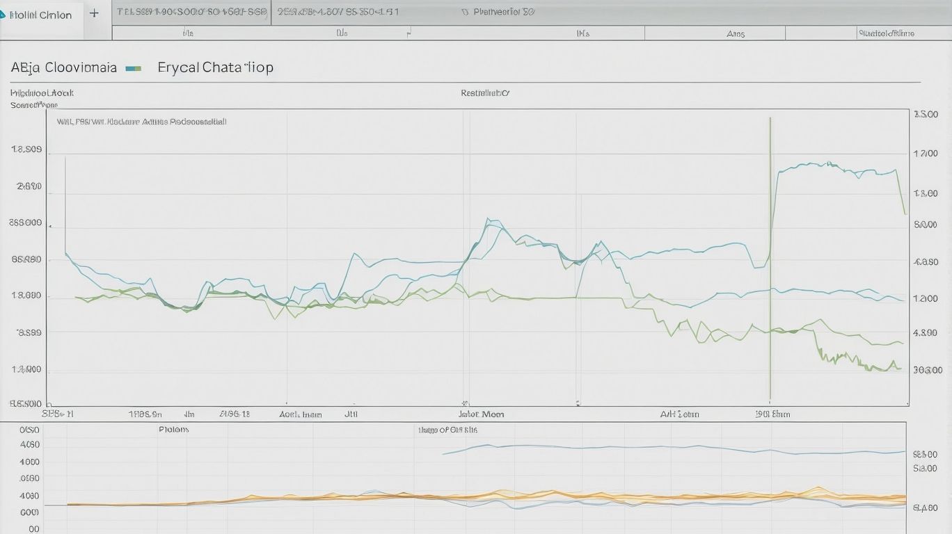
Photo Credits: Exceladept.Com by David Harris
Sparklines in Excel are a powerful tool that brings dynamic data visualization right into your spreadsheets. In this section, we’ll explore what sparklines are and how they enhance your data analysis. Get ready to dive into the world of sparklines as we uncover the different types and their unique applications. So, whether you’re a numbers nerd or a data-driven decision-maker, this section will show you how sparklines can transform your Excel experience. Let’s get started!
Types of Sparklines
The sub-topic, “Types of Sparklines,” can be presented in a table format using HTML tags. Here is an example:
| Sparkline Type | Description |
| Line Sparkline | A line that shows the trend of data over time. |
| Column Sparkline | Columns that represent data values and their variances. |
| Win/Loss Sparkline | Indicates whether a value is positive, negative, or zero. |
| Area Sparkline | Similar to line sparklines, but with shaded areas underneath. |
These are some of the types of sparklines that can be created in Excel to visualize data in a compact and informative manner.
How to Create Sparklines in Excel?
Photo Credits: Exceladept.Com by Matthew Anderson
Learn how to create captivating sparklines in Excel and make your data come alive! Discover the secrets behind changing sparkline types and styles, adjusting axis settings, adding markers, and highlighting crucial data points. Amp up your data visualization game and impress your colleagues and clients with visually stunning insights. Let’s dive into the art of crafting dynamic sparklines in Excel!
Changing Sparkline Type and Style
- Select the sparkline cells or range where you want to change the Changing Sparkline Type and Style.
- Go to the “Design” tab in the Excel ribbon.
- In the “Type” group, click on the “Type” dropdown menu to choose Changing Sparkline Type and Style, such as line, column, or win/loss.
- In the “Style” group, click on the “Style” dropdown menu to select Changing Sparkline Type and Style color scheme for the sparklines.
- You can also customize the sparkline style even further by using the options in the “Markers” and “Axis” groups.
- Once you have made the desired changes, the sparklines will update automatically to reflect the new Changing Sparkline Type and Style.
Adjusting Sparkline Axis
To adjust the sparkline axis in Excel, follow these steps:
- Select the sparkline you want to adjust.
- Click on the “Design” tab in the Excel ribbon.
- In the “Sparkline Tools” group, click on the “Axis” dropdown menu.
- Choose the option that best fits your data and visualization needs, such as “Automatic”, “Date Axis”, or “Custom”.
- If you want to make specific adjustments, select the “Custom” option and specify the minimum and maximum axis values.
- Customize the axis settings further by modifying the axis type, labels, or tick marks.
- Review the changes made to your sparkline and fine-tune them as necessary.
Adding Sparkline Markers
To enhance the visual representation of data in Excel, incorporating sparkline markers can provide additional insights. By adding sparkline markers, users can highlight specific data points or trends within a mini graph, making their sparklines more informative and visually appealing. These markers can be customized to represent important data points, such as high or low values, or to indicate significant events or changes in the data. Utilizing sparkline markers allows users to improve the effectiveness of data visualization in Excel.
Highlighting Data Points
To effectively highlight data points in Excel’s Sparklines, consider the following table:
| Method | Description |
|---|---|
| Change Sparkline Color | Increase visibility by choosing a distinct color to highlight the data points. |
| Modify Marker Style | Emphasize specific points by using different marker styles, such as circles or squares. |
| Adjust Marker Size | Make the markers more prominent or subtle by altering their size. |
| Apply Conditional Formatting to Data Points | Utilize Excel’s conditional formatting to highlight specific data points based on criteria. |
By utilizing these techniques, you can accentuate important data within your Sparklines, increasing their visual impact and effectively conveying insights.
Tips for Effective Data Visualization with Sparklines
Photo Credits: Exceladept.Com by Ethan Jackson
When it comes to effective data visualization with sparklines, a few key tips can make all the difference. We’re diving into the world of sparklines, those nifty little inline graphs in Excel, and exploring how to make the most out of them. In this section, we’ll uncover the secrets behind choosing the right sparkline type, designing them for maximum impact, and how to unleash their power in different Excel functions. Prepare to be amazed by the potential these tiny graphs hold for displaying your data in a visually compelling way.
Choosing the Right Sparkline Type
Choosing the right sparkline type in Excel is essential for effectively visualizing your data. Here are some steps to help you make the right choice:
- Identify your data: Understand the nature of your data, whether it’s time-based, categorical, or numerical.
- Determine your objective: Decide what you want to convey with your sparkline, such as trends, comparisons, or distributions.
- Consider data density: Assess the number of data points you have and choose a sparkline type that can handle the data without cluttering the visualization.
- Choose the appropriate sparkline type: Based on the previous steps, select the ideal sparkline type, such as line, column, or win/loss, that best represents your data and objective.
- Review and refine: Evaluate the chosen sparkline’s clarity, readability, and relevance to ensure it effectively communicates your data insights.
By following these steps, you can confidently select the right sparkline type in Excel for an impactful and informative data visualization.
Designing Sparklines for Maximum Impact
- When designing Sparklines for Maximum Impact, it is crucial to follow a few key steps to effectively convey the intended message.
- Firstly, choose the right sparkline type that best represents your data, such as line, column, or win/loss.
- Next, design the sparklines to be visually appealing by selecting appropriate colors, markers, and line styles.
- Make sure that the sparklines are easy to understand by providing clear labels and axis titles.
- Consider the size and placement of the sparklines within your Excel sheet to ensure they are visible and not cluttered.
By following these steps, you can successfully create sparklines that have a maximum impact and effectively communicate your data insights.
Suggestions for achieving maximum impact with sparklines:
- Experiment with different designs and styles to find the most visually engaging sparklines for your data.
- Take into account the overall theme and purpose of your Excel sheet to ensure that the sparklines align with the overall aesthetic.
- Regularly update and refresh the sparklines to reflect changes in the underlying data, thus keeping them relevant and accurate.
Using Sparklines in Different Excel Functions
One can greatly enhance data analysis and visualization by incorporating sparklines in different Excel functions. Here is a table highlighting some key Excel functions where sparklines can be effectively used:
| Function | Description |
|---|---|
| Conditional Formatting | Apply sparklines to highlight trends based on cell values. |
| Pivot Tables | Incorporate sparklines to make patterns and comparisons more apparent. |
| Chart Creation | Utilize sparklines to present summarized data in a visually appealing manner. |
| Data Validation | Combine sparklines with data validation to create dynamic dashboards. |
| Formulas | Integrate sparklines in formulas to show trends or changes in data over time. |
By using sparklines in these various Excel functions, users can easily identify trends, compare data, and make insightful data-driven decisions.
Benefits of Using Sparklines in Excel
Photo Credits: Exceladept.Com by Lawrence Lee
- Benefits of Using Sparklines in Excel
- Enhanced data visualization: Sparklines provide a compact and clear representation of data, making it easier to identify trends and patterns.
- Improved data analysis: With sparklines, you can quickly compare data points and make informed decisions based on the visual representation.
- Space-saving: Sparklines are small and can be inserted directly into cells, saving valuable space on your Excel worksheet.
- Easy to create and update: Excel offers a built-in sparkline feature that allows you to create and update sparklines with a few simple steps.
- Increased efficiency: By using sparklines, you can quickly convey information without the need for extensive charts or graphs, saving time and effort.
- Clear communication: Sparklines make it easier to share data with others and ensure that the information is easily understood and interpreted.
Limitations and Considerations

Photo Credits: Exceladept.Com by Christian Jackson
When using Sparklines in Excel for data visualization, it is important to be aware of their limitations and considerations.
1. Limited customization: Sparklines offer limited options for customization compared to traditional charts. You can’t adjust axes or add titles.
2. Limited data points: Sparklines are designed to display a small number of data points, suitable for quick visual analysis.
3. Lack of context: Sparklines are most effective when used in conjunction with other data and visualizations to provide a comprehensive view.
4. Data accuracy: Since Sparklines are condensed representations of data, small changes can have a significant impact on the visualization. Ensure the accuracy of your data.
5. Scale and comparisons: Use caution when scaling your Sparklines to ensure accurate comparisons between different data sets. Remember to consider the range and proportionality between variables.
To overcome these limitations, it is important to consider the limitations and considerations of Sparklines. Furthermore, complementing Sparklines with other visualizations, such as charts, can provide additional context and insights.
Frequently Asked Questions
What are Excel’s Sparklines?
Excel’s Sparklines are small charts that can be inserted into cells in a worksheet to visually represent and show trends in data. They are used to highlight important items and can be used to show seasonal increases or decreases, economic cycles, or highlight maximum and minimum values.
How do I insert a Sparkline in Excel?
To insert a Sparkline in Excel, select a blank cell at the end of a row of data, go to the Insert tab, choose the Sparkline type (such as Line or Column), and then select the cells in the row and click OK. If there are more rows of data, the Sparkline can be added for each row by dragging the handle.
Can I customize the appearance of Sparklines in Excel?
Yes, you can customize the appearance of Sparklines in Excel. After selecting the Sparkline chart, go to the Sparkline Tools Design contextual tab. From there, you can change the chart type to Line, Column, or Win/Loss, adjust the width of the Sparkline, add markers to highlight individual values, and choose a style and color for the Sparkline. You can also show an axis if the data has positive and negative values.
How do Sparklines update in Excel?
Sparklines in Excel are dynamic and update automatically when the underlying dataset changes. If there is a change in the data range or the values within the range, the Sparklines will reflect those changes accordingly.
Is there a way to edit the data of an existing Sparkline in Excel?
Yes, you can edit the data of an existing Sparkline in Excel. Select the cell with the Sparkline, go to the Sparkline Tools Design contextual tab, and click on the “Edit Data” option. This will open a dialog box where you can change the data range for the Sparkline.
What is the size of Sparklines in Excel dependent on?
The size of Sparklines in Excel is dependent on the size of the cell they are in. They adjust dynamically based on the size of the cell to fit within it. Text can also be entered in a cell along with a Sparkline.