
Designing infographics is a dynamic and creative way to present information visually. While there are various tools available for infographic design, Excel is often overlooked as a powerful tool in this domain. In this article, we will explore the benefits of using Excel for infographic design and provide a comprehensive guide on how to get started.
Understanding the Basics of Infographic Design is essential to create impactful visuals. This includes choosing the right data, defining the objective of the infographic, and identifying the target audience. These foundational steps lay the groundwork for a successful infographic design.
Getting Started with Infographic Design in Excel involves setting up the worksheet, selecting and formatting charts and graphs, and customizing colors, fonts, and styles. Excel offers a wide range of design options to transform data into visually appealing visuals.
To enhance infographics, adding visual elements such as images, icons, shapes, and text boxes can bring life and creativity to the design. Organizing and arranging the infographic components through grouping, aligning, layering, and ordering ensures a cohesive and visually pleasing layout.
Designing effective infographics requires some tips and tricks such as keeping the design simple and clear, strategically using color, and adding labels and captions to provide context and clarity.
Finally, we will explore the steps to finalize and share your infographic by proofreading and editing, saving and exporting the infographic in various formats, and sharing and distributing it to the intended audience.
By utilizing Excel’s features and following best practices for infographic design, you can unlock your creativity and create visually stunning and informative infographics using a tool that is readily available to you.
Why Use Excel for Infographic Design?
Photo Credits: Exceladept.Com by Juan Garcia
Why Use Excel for Infographic Design?
Excel may not be the first tool that comes to mind when thinking about designing infographics, but it offers several advantages that make it worth considering. Here are a few reasons why you should use Excel for infographic design:
- Data Visualization: Excel allows you to easily organize and analyze data, making it a great tool for creating visually appealing infographics.
- Charts and Graphs: With a wide range of chart and graph options, Excel makes it simple to represent data in a visually engaging way.
- Flexibility: Excel offers a variety of customization options, allowing you to tailor your infographic to suit your specific needs.
- Data Updates: Since Excel is a spreadsheet program, it’s easy to update and modify your data, making it an ideal choice for infographics that require frequent updates.
- Integration: Excel seamlessly integrates with other Microsoft Office programs, making it easy to incorporate data from other sources and create comprehensive infographics.
Understanding the Basics of Infographic Design
Photo Credits: Exceladept.Com by Ryan Martin
Looking to dive into the world of infographic design? Let’s begin by exploring the fundamentals of creating stunning infographics. From selecting the perfect data to defining objectives and deciphering the target audience, we’ll uncover the key elements that lay the foundation for an engaging and impactful visual story. So buckle up, because we’re about to embark on a journey of creativity and data-driven design like never before!
Choosing the Right Data
When creating infographics in Excel, the process of choosing the right data is of utmost importance. It plays a vital role in ensuring that the visual representation is both visually appealing and informative. Here are some key points to consider:
- Relevance: It is crucial to select data that directly correlates with the topic of the infographic.
- Accuracy: To maintain credibility, it is essential to use reliable data from trustworthy sources.
- Completeness: A comprehensive view of the topic can be achieved by incorporating data that covers all relevant aspects.
- Visual potential: Opting for data that can be effectively visualized through charts, graphs, and other visual elements enhances the overall impact.
- Engagement: Engaging the target audience requires selecting data that resonates with them and captures their attention.
By diligently choosing the right data, impactful infographics can be created that effectively convey the desired message and engage the audience.
Remember to:
- Verify the data from credible sources.
- Utilize comprehensive and up-to-date data.
- Keep the data visually appealing and engaging.
Defining the Objective of the Infographic
Defining the objective of an infographic is crucial for creating an effective design. It sets the direction and purpose of the infographic, helping to determine the content and format. Consider the target audience and the key message that needs to be conveyed. For example, if the objective is to educate the audience about the benefits of a certain product, the infographic should highlight those benefits through clear visuals and concise information. By defining the objective, the infographic design process becomes more focused and tailored to achieve specific goals.
True story: When a company wanted to raise awareness about the importance of recycling, they developed an infographic with the objective of inspiring people to take action. By using engaging visuals and compelling facts, they successfully conveyed the message and motivated individuals to make a positive impact on the environment through recycling efforts.
Defining the objective of an infographic is essential when it comes to designing an impactful visual presentation. It establishes the direction and purpose of the infographic, ultimately determining its content and format. One must carefully consider the target audience and the key message that needs to be relayed. Suppose the goal is to educate the viewers about the advantageous qualities of a particular product. In that case, the infographic should effectively showcase these benefits using eye-catching visuals and concise yet informative details. By defining the objective right from the start, the process of designing the infographic becomes more focused and customized, thereby ensuring the achievement of specific goals.
Allow me to share a real-life incident that perfectly illustrates this concept. When a company aimed to increase awareness regarding the significance of recycling, they created a compelling infographic with the objective of inspiring individuals to take action. Through the usage of captivating visuals and powerful facts, they effectively communicated the message and successfully motivated people to make a positive impact on the environment by actively participating in recycling endeavors.
Identifying the Target Audience
Identifying the target audience is a critical step in designing infographics in Excel. Recognizing and understanding the individuals who will be viewing and engaging with your infographic is essential in customizing the content and design to cater to their specific needs and preferences. Take into consideration factors such as age, gender, interests, and knowledge level to ensure that your infographic effectively connects with the intended audience. For instance, if you are creating an infographic about a new technological device, your target audience may consist of tech-savvy individuals in their 20s and 30s. This information will serve as a guiding factor in making choices regarding visual style, language, and data presentation, allowing you to effectively communicate with your audience.
Getting Started with Infographic Design in Excel
Photo Credits: Exceladept.Com by Robert Campbell
If you’re looking to elevate your infographic game, this section is where it all begins. We’re diving headfirst into the exciting world of infographic design in Excel. Buckle up as we walk you through the essentials for getting started. From setting up the perfect worksheet to selecting and formatting captivating charts and graphs, we’ll cover it all. Plus, we’ll show you how to add that extra touch of pizzazz by customizing colors, fonts, and styles. Get ready to unleash your creativity and create jaw-dropping infographics right in Excel!
Setting Up the Worksheet
To begin the process of setting up the worksheet for designing infographics in Excel, you can follow these steps:
- Start by either creating a new worksheet or opening an existing one that provides enough space to accommodate your infographic.
- Take the time to define the layout of the infographic by setting up columns and rows, and adjust their widths and heights as needed.
- Be sure to label each cell or range of cells with the corresponding data or information that you want to include in the infographic.
- Enhance the visual appeal of the text by formatting the cells with appropriate font styles, sizes, and colors.
- To visually represent the data, you can insert various types of charts or graphs such as bar charts, pie charts, or line graphs.
- Customize the appearance of these charts or graphs to match the overall design of the infographic by adjusting colors, fonts, and styles.
- For additional visual appeal, consider adding elements like images, icons, shapes, or text boxes to the worksheet.
To maximize the effectiveness of your worksheet setup, you can consider the following:
- Create a color palette to ensure consistency throughout the infographic.
- Use clear and concise labels to make the information easy to understand.
- Utilize cell formatting features such as borders or shading to visually organize and highlight specific sections of the worksheet.
Selecting and Formatting Charts and Graphs
Selecting and formatting charts and graphs is a crucial step in designing effective infographics in Excel. It involves carefully choosing the right type of chart or graph that best represents the data you want to visualize. Formatting options like colors, fonts, and styles can enhance the visual appeal and clarity of the infographic. Here is a table highlighting key considerations when selecting and formatting charts and graphs:
| Consideration | Examples |
| Type of Data | Line chart for trends, bar chart for comparisons, pie chart for proportions |
| Data Labels | Add labels to provide context and make the information more readable |
| Color Palette | Use a consistent color scheme to convey meaning and aid comprehension |
| Font Style | Choose a readable font that complements the overall design |
| Chart Layout | Ensure the chart is well-organized and easy to interpret |
Selecting and formatting charts and graphs appropriately is essential for creating visually appealing and communicative infographics in Excel.
The use of charts and graphs to represent data dates back centuries. In the 18th century, William Playfair, a Scottish engineer and economist, pioneered the use of graphical methods to illustrate economic data. Since then, the practice of selecting and formatting charts and graphs has evolved with advancements in technology and design principles. Today, with the help of tools like Excel, individuals and organizations can create impactful infographics that effectively convey information and insights.
Customizing Colors, Fonts, and Styles
Customizing colors, fonts, and styles in infographics created in Excel allows designers to enhance the visual appeal and effectively convey their message. Here is a list of steps to customize these elements:
- Choose a color scheme that aligns with your branding or the topic of your infographic and styles.
- Modify the fonts to ensure readability and consistency throughout the design.
- Experiment with font sizes, styles, and effects to highlight important information and styles.
- Use formatting tools to adjust the color, size, and transparency of shapes, charts, and text boxes and styles.
- Apply gradients, shadows, or 3D effects to create depth and visual interest and styles.
- Consider using icons, images, or symbols to represent data or concepts visually.
- Maintain a consistent style and color palette to create a cohesive and professional-looking infographic and styles.
Adding Visual Elements to Enhance Infographics
Photo Credits: Exceladept.Com by Alexander Johnson
In the exciting world of designing infographics in Excel, one key aspect that can take your creations to the next level is adding visual elements. This section dives into the art of enhancing infographics by inserting captivating images and icons, as well as creating eye-catching shapes and text boxes. Get ready to unleash your creativity and make your infographics visually impactful!
Inserting Images and Icons
When designing infographics in Excel, it is important to consider the use of images and icons to enhance visual appeal and reinforce the message. Here are the step-by-step instructions for incorporating inserting images and icons in Excel:
- To start, select the cell where you would like to insert the image or icon.
- Next, navigate to the Insert tab in the Excel Ribbon.
- Click on the Pictures button to insert an image from your computer.
- You can resize the image by either dragging its corners or manually adjusting the size.
- If you want to insert an icon, click on the Icons button and choose from a variety of pre-designed icons.
- Select the desired icon and click Insert to add it to the selected cell.
- Customize the image or icon by applying formatting options such as resizing, cropping, or adding effects.
The use of images and symbols to convey information has been a practice dating back to ancient civilizations. From cave paintings and hieroglyphics to medieval manuscripts, visual elements have always been incorporated to enhance communication and storytelling. Today, this tradition continues in the form of inserting images and icons in infographics, allowing designers to craft visually appealing and informative visuals.
Creating Shapes and Text Boxes
Incorporating shapes and text boxes into Excel is a vital aspect of infographics design. To achieve this, follow these steps:
- Access the “Insert” tab in Excel.
- Select either the “Shapes” or “Text Box” option, depending on your desired addition.
- Choose the preferred style of shape or text box from the menu that appears.
- Click and drag on the Excel worksheet to draw and adjust the size of the shape or text box.
- Customize the color, outline, font, and other formatting options to personalize the shape or text box.
- Add text to the text box by double-clicking on it and typing your desired content.
To create visually attractive infographics, consider the following suggestions:
– Utilize various shapes to represent different data points or concepts.
– Experiment with text box placement for improved organization and readability.
– Ensure neat alignment and visual balance between the shapes, text boxes, and background by adjusting their positions.
– Enhance visual impact by incorporating contrasting colors between the shapes, text boxes, and background.
– Test different font styles and sizes to find the most suitable ones for your infographic.
By integrating these steps and suggestions effectively, you can incorporate shapes and text boxes seamlessly into your Excel infographics.
Organizing and Arranging Infographic Components

Photo Credits: Exceladept.Com by Larry Walker
When it comes to designing infographics in Excel, one crucial aspect is organizing and arranging the various components. In this section, we’ll explore two key techniques: grouping and aligning objects, and layering and ordering elements. By understanding these techniques, you’ll be able to seamlessly structure your infographic elements for maximum impact and clarity. So, let’s dive in and discover the art of strategically arranging infographic components in Excel!
Grouping and Aligning Objects
When creating infographics in Excel, it is crucial to incorporate the techniques of grouping and aligning objects. These methods are vital for achieving a visually appealing and well-organized layout. By grouping similar objects together, you can easily manipulate and edit them as a unified whole. Utilizing alignment tools allows you to ensure that your objects are positioned correctly and evenly spaced. This not only contributes to a professional design but also establishes a sense of balance. For instance, you can group charts, icons, and text boxes that are related to a specific section of the infographic. By aligning these elements, you can maintain consistency and enhance the readability and comprehension of your infographic.
Layering and Ordering Elements
Layering and ordering elements is a crucial aspect of designing effective infographics in Excel. By organizing the components in a visually appealing and logical way, you can enhance the overall impact and clarity of your infographic. Here are some key considerations for layering and ordering elements:
- Grouping and aligning objects: Use the grouping feature to combine related objects, like charts or text boxes. Aligning objects ensures a neat and organized layout.
- Layering elements: Arrange elements in layers to create depth and hierarchy. Bring important elements to the forefront by placing them in the foreground, and use the background for supporting information.
By implementing proper layering and ordering techniques, you can create visually pleasing and engaging infographics in Excel.
Tips and Tricks for Designing Effective Infographics in Excel
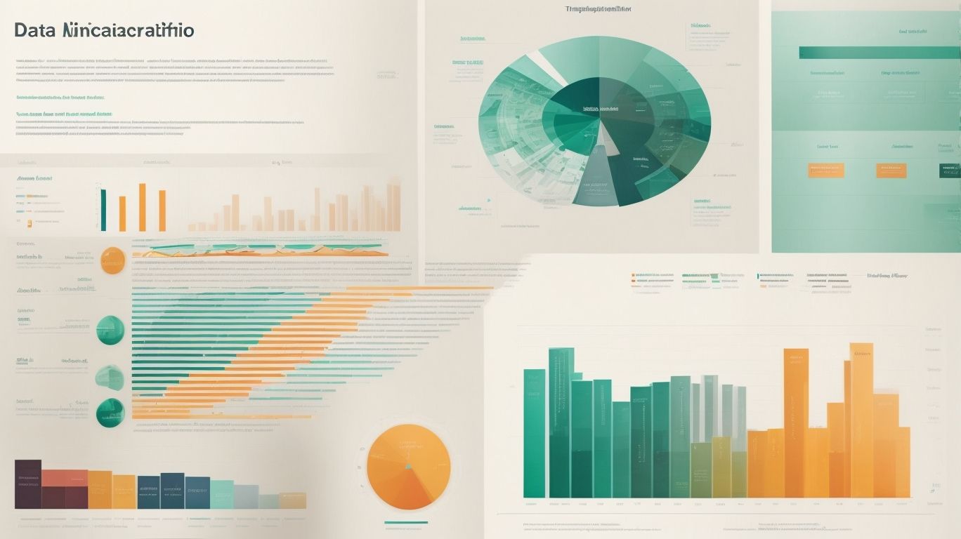
Photo Credits: Exceladept.Com by Gabriel Flores
Designing effective infographics in Excel can be a creative and exciting endeavor. In this section, we’ll uncover a variety of tips and tricks that will take your infographics to the next level. From keeping your designs simple and clear to using color strategically and adding impactful labels and captions, we’ll explore proven methods to enhance the visual appeal and communication power of your infographics. Get ready to transform your data into stunning graphical representations with these expert techniques.
Keeping it Simple and Clear
- When designing infographics in Excel, it is crucial to keep it simple and clear. To achieve this, condense complex data into concise, easily digestible insights.
- Opt for simple charts, graphs, and icons that effectively convey the message. This will help maintain visual consistency and keep the information clear.
- Stick to a minimal color scheme when designing infographics in Excel. By limiting the color palette, you can enhance the visual appeal and maintain clarity.
- Enhance readability by allowing ample breathing room between elements. Employing white space will make the infographic easier to understand and navigate.
- Text should be legible and provide clear context for each section. Use clear headings and labels to ensure the information is easily comprehensible.
Using Color Strategically
- Strategically using color is crucial when designing infographics in Excel.
- Here are some effective ways to incorporate color into your designs:
- Highlighting important information: Utilize vibrant colors to draw attention to key data or important sections of your infographic.
- Creating visual hierarchy: Incorporate different shades and tones of color to establish contrast and hierarchy within your design, facilitating easier navigation and comprehension of the information.
- Establishing a cohesive theme: Opt for a color scheme that aligns with your brand or the topic of your infographic, resulting in a consistent and cohesive visual experience.
- Eliciting emotions and conveying messages: Take advantage of the psychological associations different colors possess. Select colors that evoke the desired emotions or convey the intended messages for your audience.
- Ensuring readability: Consider the contrast between text and background colors to guarantee that all text is easily legible.
Adding Labels and Captions
Adding labels and captions to infographics in Excel is essential for improving comprehension and directing the viewer’s attention. In order to effectively incorporate labels and captions, here are some helpful tips:
- It is crucial to label your charts and graphs properly. This will ensure that each element of your infographic is clearly identified, providing context and guiding interpretation.
- For additional information, add concise and descriptive captions below images or charts.
- To emphasize important data or insights, it is recommended to highlight key points using bold or larger text.
- Make sure that labels and captions are neatly aligned with the corresponding elements to avoid any confusion.
- When selecting fonts and colors, prioritize readability. Choose fonts that are easy to read and colors that provide good contrast for legibility.
By following these suggestions, you will be able to create visually appealing and informative infographics that effectively communicate your message.
Finalizing and Sharing Your Infographic
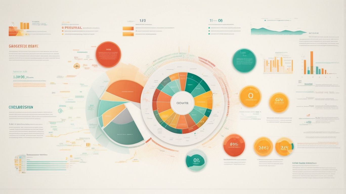
Photo Credits: Exceladept.Com by Charles Clark
Finalizing and sharing your infographic is the crucial last step in the creative process. We will cover the essentials in this section, including proofreading and editing to ensure your infographic is error-free and polished. Then, we’ll dive into saving and exporting your masterpiece, exploring different file formats and sizes to suit your needs. We’ll discuss effective strategies for sharing and distributing your infographic to reach your target audience far and wide. Let’s bring your infographic to the world!
Proofreading and Editing
Proofreading and editing are critical steps in creating effective infographics in Excel. Here are some guidelines to follow:
- Review the content: Thoroughly read the text and ensure that it is clear, concise, and free from errors.
- Check for consistency: Confirm that the formatting, font styles, and colors remain consistent throughout the infographic.
- Edit for clarity: Ensure that the information is presented in a manner that is easy to comprehend and interpret.
- Proofread for grammar and spelling: Take the time to double-check for any grammatical errors or spelling mistakes.
- Verify data accuracy: Validate that all statistics and data presented in the infographic are accurate and up to date.
Remember the importance of dedicating sufficient time to carefully proofread and edit your infographic to give it a polished and professional appearance.
Saving and Exporting the Infographic
To save and export your infographic in Excel, follow these steps:
- Ensure that your infographic is complete and edited.
- Navigate to the “File” tab and choose “Save As”.
- Select a file format, such as JPEG or PNG, to save your infographic.
- Specify the destination folder where you wish to save the file.
- Simply click on “Save”.
Pro Tip: When saving your infographic, it is advisable to export it in different file formats to guarantee compatibility across various devices and platforms.
Sharing and Distributing your Infographic
- Sharing and distributing your infographic is essential for expanding its reach and maximizing its impact. To effectively share and distribute your infographic, follow these steps:
- Create a shareable format: Save your infographic in a widely compatible format, such as PNG or PDF, to ensure easy accessibility and shareability.
- Optimize for social media: Resize your infographic to fit different social media platforms and create separate versions with eye-catching thumbnails and headlines for each platform.
- Share on your website or blog: Embed the infographic on your website or blog using HTML code to make it easily accessible and visually appealing to your visitors.
- Utilize email marketing: Enhance your email newsletters by incorporating the infographic as a visual element to engage subscribers and encourage sharing.
- Share on social media platforms: Boost the visibility of your infographic by posting it on relevant social media platforms with captivating captions and relevant hashtags.
- Submit to infographic directories: Increase the exposure and sharing potential of your infographic by submitting it to reputable infographic directories and platforms.
- Collaborate with influencers and industry experts: Reach out to influencers or experts in your industry and request them to share your infographic with their followers or include it in their content.
Frequently Asked Questions
How do I create a visually effective Excel chart to display data?
Follow these steps to create a visually effective Excel chart:
1. Insert a data table with the required values.
2. Go to Insert, select a chart type such as a Clustered Column chart.
3. Customize the chart by adding icons or images using the Insert tab.
4. Format the icons or images by adjusting their size, outline color, and fill color.
5. Transfer the icons to the chart by copying and pasting them onto the corresponding series.
6. Adjust the gap width to widen the icons if necessary.
7. Format the chart axis to display a maximum value of 100% on the vertical axis.
8. Customize the appearance of the chart area by removing axis labels and gridlines and adding a chart title.
9. Add data labels to the chart to display the values of the series.
10. Save and finalize the chart to create a visually effective infographic.
How can I add icons to an Excel chart?
To add icons to an Excel chart, follow these steps:
1. Open Excel and go to the Insert tab.
2. Click on the Icons option and select the desired icon from the available options.
3. Press Insert to add the selected icon to the spreadsheet.
4. Customize the appearance of the icon by filling it with a desired color and adding a black outline.
5. Duplicate the icon if needed and change the fill color to create different variations.
6. Copy and paste the icons onto the corresponding series in the chart to add them as visual elements.
7. Adjust the size and positioning of the icons as required for the desired visual effect.
How can I change the fill color of an icon in an Excel chart?
To change the fill color of an icon in an Excel chart, follow these steps:
1. Select the icon or icons that you want to modify.
2. Go to the Format tab and navigate to the icon’s fill settings.
3. Choose the desired fill color from the available options or use the “More Fill Colors” dialog to select a custom color.
4. Apply the chosen fill color to the selected icons, and they will update accordingly.
What is a data table in Excel and how do I prepare one for use in a chart?
A data table in Excel is a structured range of cells that contain information in tabular form. To prepare a data table for use in a chart, follow these steps:
1. Open Excel and enter the data in rows and columns.
2. Ensure that each column represents a different series or category of data.
3. Include a row for the titles or labels of each column.
4. Format the data table by applying formatting styles, such as borders or fill colors, for better visual clarity.
5. Verify that the data table contains the correct values and labels for the chart you intend to create.
6. Select the entire data table and go to the Insert tab to choose a chart type and insert the chart based on the prepared data.
How can I widen the icons in an Excel chart?
To widen the icons in an Excel chart, follow these steps:
1. Select the series to which the icons belong by clicking on any data point in that series.
2. Right-click and choose “Format Data Series” from the context menu.
3. In the Format Data Series pane, navigate to the “Series Options” section.
4. Adjust the “Gap Width” setting to increase or decrease the gap between the icons, effectively widening or narrowing them.
5. Preview the changes in the chart and modify the gap width as needed until the icons have the desired width.
How can I set a background grey image for an infographic in Excel?
To set a background grey image for an infographic in Excel, follow these steps:
1. Open Excel and select the worksheet in which you want to create the infographic.
2. Go to the Page Layout tab and click on the “Background” button in the “Page Setup” group.
3. Choose “Printed Watermark” from the drop-down menu.
4. Click on the “Picture Watermark” option and browse for the grey background image you want to use.
5. Adjust the scale, washout, and transparency settings as desired.
6. Click “Apply” to set the grey background image as the watermark for the selected worksheet.
7. Create your infographic on top of the background image, using charts, icons, text, or other visual elements.